🖥️ Adjust View
The Adjust View menu is the cockpit for the visual representation of your knowledge network. Since the InfoRapid KnowledgeBase Builder can effortlessly manage millions of items, you determine in this menu how much data is loaded on the screen at the same time, from which perspective (2D/3D/Table) you view it, and according to which layout algorithm the map automatically arranges itself.
🪟 The Three View Modes (2D Diagram, 3D Diagram, Table View)
In the toolbar at the top right, you can switch between three completely distinct display modes at any time:
- 2D Diagram: The classic, flat mind map and flowchart view. It provides 20 layout algorithms and high-speed rendering for daily editing.
- 3D Diagram: The spatial three-dimensional view. You can freely orbit the camera with the mouse or finger, zoom seamlessly, and let the diagram rotate automatically.
- Table View (Tabular Representation):
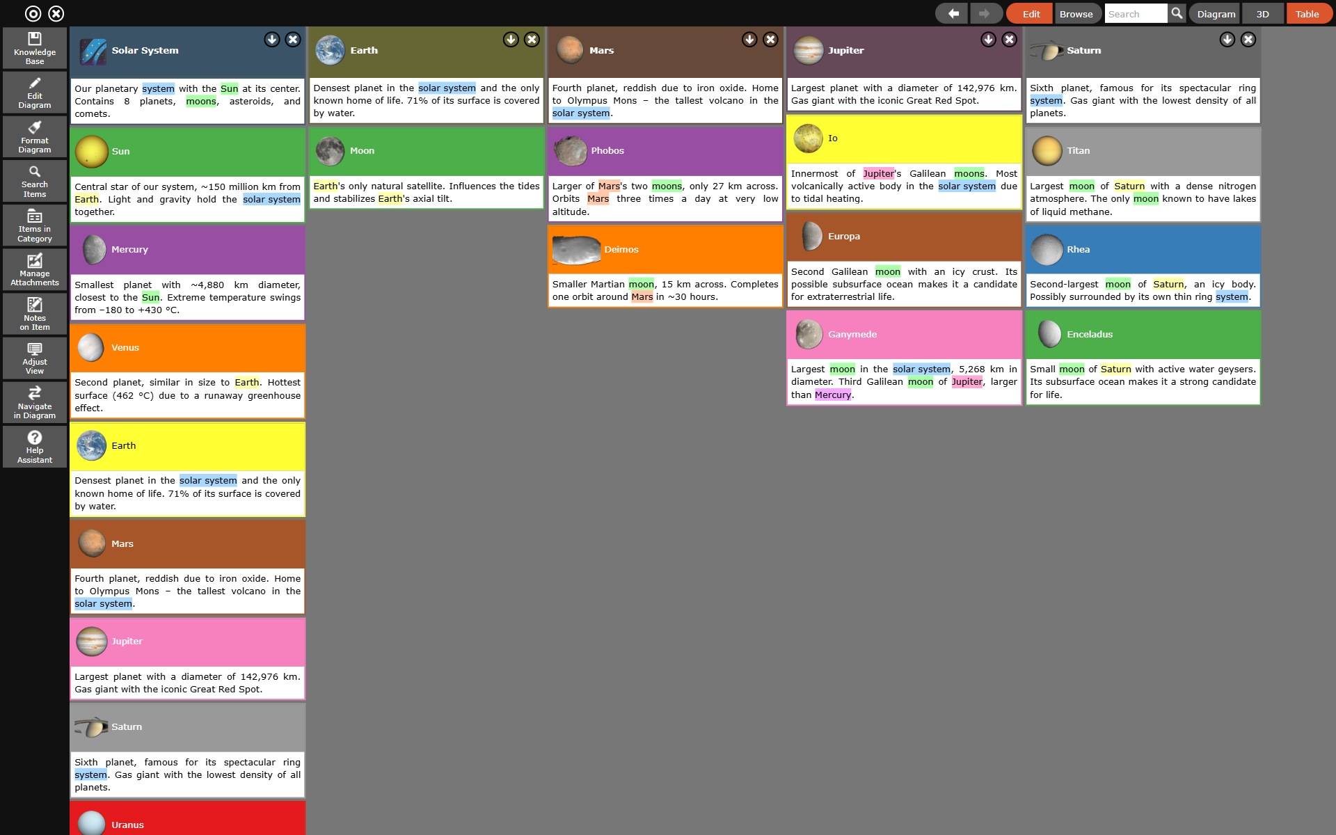
- Click the Table button in the top-right toolbar to display the current diagram structured as a hierarchical table.
- Structure and Hierarchy: The view organizes nodes as an expandable indented tree starting from the current root node. Alongside item names, you can inspect assigned categories, tags, descriptions, and linked attributes at a glance.
- Table Relations ("As Table"): Relations designated as "As Table" in their properties dialog (indicated by a
T:prefix in the label) are rendered directly as structured attribute-value rows beneath their parent node. - Manual Reordering via Drag & Drop: To reorder items within the same hierarchy level, click or press an item for more than 2 seconds until it lifts, then drag and drop it into its new position.
- Effect on Ranking and Kanban: The display order set here establishes the internal sequence rank (
sn) of items. This ranking is simultaneously applied in Presentation Mode (slide progression sequence) and on Kanban boards (card sequence within columns). - Editing and Notes: Clicking any row selects the item in the diagram context; the Notes panel allows reading and editing rich HTML text alongside the table.
- Return to Diagram: Return to the visual diagram at any time by clicking the Diagram (2D) or 3D button in the top-right toolbar.
🕒 Timeline
The button with the calendar icon in the top-right toolbar, to the right of the search field and to the left of the Diagram / 3D / Table view switches, shows and hides the timeline: a horizontal strip below the drawing area that holds every item of the database carrying a date in the Dates tab of the properties dialog (see Edit Diagram). It is a navigation aid just like the search field next to it: it leads to an item of the database, no matter what is currently loaded in the diagram.
What the strip shows
- Bars, points and diamonds: An item with a start and an end appears as a bar, an item with a single point in time as a point. Deadlines (field Due) are drawn as a diamond — the usual notation for a milestone.
- Several entries per item: Which fields reach the strip is decided by the type of the item. A person appears with their life span from birth to death, a milestone with its due date, an event with its start and end. A task with a period and a due date appears twice: as a bar and as a diamond, the latter carrying its field in its name, "Sprint 12 (Due)".
- Colours: Every entry carries the colour of the category of its item, so task kinds, project phases or responsibilities stay distinguishable on the strip as well.
- The whole database, not just the current section: The strip shows dated items whether or not they are currently loaded in the diagram — up to 5,000 entries. The right-hand side of the header states how many items with a date were found; a "+" behind the number means the limit was reached.
- Selection and root item: The item selected in the diagram is highlighted with a frame on the strip and scrolled into the visible period if needed. The root item is recognisable by its own colour.
- If the database holds no dated item at all, the strip reports No items with a date in this database.
Panning, zooming and jumping
- Jumping to an item: Clicking an entry takes the same route as the search results, history entry under Navigate in Diagram included. If the item is already visible in the diagram it is only selected there; otherwise it is loaded as the new centre of the diagram. With Always Load Target switched on under Navigate in Diagram a click always loads.
- Making an item the root: Double-click an entry and its item always becomes the new centre of the diagram, even when it is already visible there. The strip stays open while you do so, which lets you walk through a project — or through history — step by step along its schedule.
- Panning: Drag inside the area with the mouse or a finger to move the visible period.
- Zooming: with the + and − buttons in the header, with the mouse wheel, with two fingers on a touch device, or by double-clicking an empty spot of the strip. The axis changes its step on its own — from decades and years through months and weeks down to days, hours and minutes.
- Overview bar: The narrow bar at the very bottom shows the distribution of all dated items over time and, inside it, the section currently visible. Drag inside that bar to jump to a completely different part of the time axis.
- Today: The Today button in the header moves the section to the current day without changing the zoom. Useful when you have paged far away, or when the database holds life dates from the century before last.
- Weekends: Saturday and Sunday sit on a shaded band, and from the day level onwards the weekday appears in the label. That shows at a glance whether a task runs across a weekend. Zoomed far out the band disappears, because the days get too narrow.
- Changing the height: A grip sits on the upper edge of the strip — drag it up or down. The drawing area of the diagram gives up the space and is re-fitted automatically.
- When it gets crowded: Where not all entries fit on top of each other, a number such as +7 appears. Hover over it and the tooltip names what is hidden; a click enlarges the timeline until everything fits, up to seventy percent of the window height. The selected item and the root item always get a place, however flat the strip is.
- Closing: with the cross on the right of the header, or with the toolbar button again.
Dating and rescheduling with the mouse (edit mode only)
With edit mode switched on the timeline is not just a display but an input surface:
- Dating an item: Drag an item from the diagram onto the strip — using the same handle that creates a connection. A line follows the pointer, the strip gets a frame, and a marker shows which point in time would be hit. On release the item receives that date. An item that already has one keeps its time of day and its duration and is merely moved. This is the quickest route to a first date, with no dialog at all.
- Moving: Drag a bar to another place and its start and end move together. Only the selected entry can be grabbed; on any other one a drag pans the view, and a click selects it first. That way a date cannot slip by accident when you only meant to look.
- Changing the duration: Drag one of the two edges of a bar and only that side moves. Dragging the name next to it moves the end as well — and that is also how you give a single point in time an end and turn it into a period. Drag the end back onto the start and it becomes a single point in time again, with the end field left empty.
- Snapping: Dragging happens in whole days at most, in whole hours or minutes when you zoom in far. A time of day that has been entered is preserved, and an entry without one always moves in whole days. Calendar days are counted, not working days.
- Beyond the edge: Drag to the left or right edge of the strip and the visible period moves along — the way the drawing area scrolls under a dragged card. That way you reach dates far outside the current section. While you drag, a tooltip shows the period that would be stored.
- Written back into the field the entry came from: The bar of a person moves birth and death, the bar of a task start and end. Every completed drag is a single Change Dates step in the undo stack.
The timeline applies to all three views
The strip shares its height with the drawing area and is therefore available in the 2D diagram, in the 3D view and in the table view alike.
Remembered state and saved views
Whether the strip is open and how high it stands is remembered per device: showing or hiding a navigation aid is not a change to the diagram and therefore never enters the undo stack. Save View additionally writes both settings into the database, and they come back with the saved view.
💾 Saved Views (Bookmarks)
If you work in large networks, you will want to quickly find specific views again. Here you can save your current state as a bookmark.
- Save View: Saves all current settings of this menu (zoom, layout, filters) as a new view. The arrangement of the side panels is saved along with it: which ones are open, and how wide you have dragged the Notes on Item and Search Items windows. The timeline — whether it is open and how high it stands — and the settings of a Kanban board are saved along with it as well.
- Pro Tip: Make sure to check the "Save root item" box in the save dialog! When you open the view later, the program immediately centers the diagram exactly on this origin node. Check the box for "Set as initial view" so that this view is automatically loaded every time the app starts.
- Saved Views (Drop-down): Select a previously saved view (e.g., "Initial View") here to load it at lightning speed.
- Update View: Overwrites the selected view with your current settings.
- Delete View: Removes the view from your list.
🔎 Camera & 3D Control
With these seamless sliders, you control the virtual camera in 3D space:
- Zoom: Increases or decreases the size of the diagram.
- 💡 Professional Tip for Exporting: If you export your diagram as an image via the Knowledge Base menu and the result looks blurry, increase this Zoom slider to 150% or 200% before exporting! The image will then be rendered in a significantly higher resolution to ensure a clear print.
- Distance: Regulates the distance or the length of the connection lines between the individual nodes. Drag the slider to the right to "loosen up" densely packed maps.
- Rotation & Rotation Speed: Controls the automatic rotation of the entire diagram (useful for 3D views or video recordings).
- Perspective: Changes the 3D depth effect. At 0%, the diagram looks completely flat (2D orthogonal); the higher the value, the stronger the spatial 3D effect.
- Text Orientation (Dropdown, 3D view only): Determines how the labels are placed in space. The setting only appears once you have switched to the spatial view with the 3D button.
- To viewer: Every label turns with the camera and therefore always stays readable head-on. The best choice when you rotate the diagram or record a video.
- Static: The labels are anchored in space and turn with the diagram. Spatially consistent, but hard to read at some angles.
- Radial: The labels align along the direction of their node. Emphasises the structure, but is the hardest to read.
🔀 Diagram (Layout Algorithm)
The system takes care of manual sorting for you. In this section, you define the basic structuring logic.
- Layout (Drop-down): Choose from a variety of professional arrangements:
- 2D Layouts (20 variants):
- Mind Map (straight lines / curved lines / trajectory): Classic branching tree structures.
- Mind Map radial (straight / curved / trajectory): Child items arrange themselves circularly around the center.
- Concept-Map (radial / hierarchical): Structured associative network.
- Hierarchical & Hierarchical Grouped (combined lines): Ideal for organizational charts and system architectures.
- 1-Column Grouped / 2-Columns Grouped: Excellent for chronological sequences, timelines, and parallel streams.
- Flowchart (top -> bottom / left -> right): Forces the diagram into a strictly linear process direction.
- Kanban / Matrix: Arranges elements as an agile board (columns & swimlanes). Configuration of axes, cards, and sprint tools is handled in the Tools menu (see also the Kanban and Scrum Boards tutorial).
- 3D Layouts (5 variants, active in 3D view):
- MindMap radial (3D): Spherical radial distribution.
- Tree (levelwise / levelwise both sides / relation direction): Spatial 3D tree hierarchies.
- Spherical (Kugelförmig): Projects the network evenly onto a surrounding 3D sphere.
- 2D Layouts (20 variants):
- Decrease Child Items: Determines how the size of sub-items behaves (Same height, Child count wise, Level wise).
Special cases for Kanban / Matrix and Whiteboard
- Kanban / Matrix: Choosing Kanban / Matrix in the layout drop-down switches the diagram to board view. All board controls and configuration settings (columns, swimlanes, ranking, category labels, sprint handover) are located in the Tools menu. In Kanban layout, Rotation, Rotation speed, and the Rotate button are hidden.
- The whiteboard is not a layout: If you want to arrange cards freely by hand, use the Whiteboard in the Tools menu. It is an independent mode. While it is active, the layout drop-down is hidden.
Display switches:
- Expand Items (Checkbox): Very powerful! If this is activated, the detailed description text is not just shown as a tooltip when clicking, but is written directly in full length into the node boxes in the diagram.
- Mark Root Item: Visually highlights the central starting node of the current section.
- Show Cross Connections: Shows or hides lines that run across between the hierarchy branches.
- Show Table Relations: Determines whether relations that were set to As Table in the Edit Relation dialog are still drawn as lines in addition. Switch the option off and those relations only appear as table rows inside the two items involved. That tidies up diagrams with many attributes considerably. How to prepare a relation for this is described in Build a Knowledge Base.
- Show Data Fields: Shows the data fields an item carries in the Dates tab of its properties dialog — start, end, status, assignee and everything else. They appear as additional rows of the table below the item name, underneath the rows coming from table relations and in the notation of your interface: a date as 26.04.1889 or 04/26/1889, a time of day only when one has been entered, and a choice value translated instead of as its key. The switch is off by default, applies per diagram and is stored with it. Note that items grow taller as a result — which weighs particularly heavily in the 3D view. How to fill the fields is described in Edit Diagram.
- Collapse duplicate Relations: Combines multiple lines that run between exactly the same two nodes into a single line to create clarity.
- Edit Mode: Toggles the display of UI control elements for editing on or off.
- Animate Transitions: Activates smooth camera flights when clicking on new nodes. Pro Tip: Turn this off on very weak devices or extremely large maps to increase performance.
🏷️ Labels (Labeling Indicators)
Items often have small symbols or counters on their corners. Here you control which additional information the diagram displays:
- Show all Labels: A global switch for all text and symbol badges.
- Show Category Labels / Show Note Labels / Show Description Labels: Displays the icons that indicate that an item belongs to a category, possesses an HTML note, or has a description text (question mark icon). The category label switch also shows the tags of an item as additional coloured labels.
- Show More Item Count (+3): Activates the small orange boxes. These indicate how many direct sub-items (child items) still exist that are currently hidden due to space constraints.
- Show Hidden Item Count (+5): Activates the gray boxes. These indicate how many cross connections are currently not displayed on the screen.
- Show Item Shift: Highlights whether an item has been manually moved (in the diagram or in the table view) away from its calculated automatic layout position.
👁️ Visible Diagram Section (Performance Control)
This is the most important area for the speed of the app. For performance reasons, the system never loads millions of nodes at the same time.
- Max. Number of visible Items (Default: 100): Limits the maximum number of nodes on the screen. If you have a powerful PC, you can increase the value. Attention: If the app becomes slow, reduce this value! The program cleverly re-centers maps anyway when you click on nodes at the edge.
- Max. Number of visible Levels: Limits how deep the branches are drawn into the sub-levels (Level 1, Level 2, etc.).
- Max. Child Items in Level 1 to 4: Here you can granularly specify from how many branches per level the system should pack the rest into the orange "(+X)" box.
🔽 Filters & User Interface
- Item Category Filter / Relation Category Filter: Allows you to completely hide certain categories from the current diagram (e.g., to only show the "important" nodes for a presentation, while "drafts" remain invisible). The entries also apply to tags of the same name.
- Show Only Selected: Switches the filter mode. Switched off (default), an element disappears as soon as one of its labels is switched off. Switched on, an element stays visible as long as at least one of its labels is switched on. That is ideal for isolating a single tag.
- User Interface: Here you can customize the color theme of the entire app interface (e.g., to the classic "Dark Mode" or "Blue").